Showing posts with label ocean. Show all posts

Sunday, March 9, 2014

Impressionist ocean paintings and ipads


This lesson successfully tackled monochromatic color mixing, interpreting light and nature, impressionism, and expressionist painting. 

I did this lesson at the very beginning of the year with seventh grade. I was just starting at my new school and wasn't sure where my students skills were at- this lesson worked really well as it gave me a chance to see what they knew and were comfortable with but gave them a more open ended way of working. Tempera paint was all we used. It would be great for 4th through 7th grade. 

We have a one-to-one Ipad program at my school. It has been incredible for my art teaching, opening up so many possibilities for my lessons. This was the first lesson I used them for.


My students went down to the waterfront with me [in the ten minutes it rained that day of course] and took photos of the ripples in the bay from the docks. (I know, I know, I'm living a dream right now...) but seriously... the students cropped the image down and translated them into paintings. I provided a slide show of Van Gogh, Monet, and Homer's paintings that all included water before they began painting.
References to Van Gogh, Monet, & Homer


Friday, May 18, 2012

Sea Turtles


This lesson was based on a popular pinterest find originally from Kristin at  ForTheLoveOfArt:

I did this lesson on CROPPING a composition with kindegarten - takes about 45 minutes total.
They came out great.


Monday, October 17, 2011

unexpected sources of motivation & inspiration

I had a really interesting weekend and Monday!


Today I saw Shine Brite Zamorano's post about Lee Gainer mentioning our cylinder lesson on her blog! So cool!
I emailed her today as well to thank her- she sent along two more great artist resources too:
Amy Genser and Hadieh Shafie
She also mentioned she was partially influenced by SUSHI for the body of work that we examined.

Additionally, this weekend I was in Baltimore, yesterday I decided to take a break from the football game viewing and go for a walk- I walked by a t-shirt store and decided to go in because the designs reminded me so much of I'm the Biggest Thing in the Ocean. It turns out it was- the store was Squidfire- the company that Kevin Sherry and his friend started. The guy working there was one of the screen-printer's and coincidentally moved there from Boston and used to go Tufts and the School of the Museum of Fine Arts in Boston like I did for grad school. I was able to take pictures of all the underwater creatures hanging around the store and see the amazing amount of designs they create. Really fun especially considering I recently used the book as a reference for the Kinder Fish and Octopus Pictures lessons.


Wednesday, September 28, 2011

Intro to color, collage, resist, & 3-D FISH


Kindergarten under water adventures with watercolor, oil pastel, shapes, warm/cool, 
resist, and 3-dimensions. 


First off... texture rubbings and watercolor resists to create our oceans. 
(However we used blue and turquoise tempera cakes.)

After we read Fish Eyes by Lois Ehlert the students drew a fish using shapes. 
Then we learned about warm colors and oil pastels and colored the fish in 'carefully'. 


The next day we read I'm the Biggest Thing inthe Ocean. 
I taught the kids how to draw a crab by breaking it down into shapes- they did awesome! 
The crab drawings are hilarious. 
 

The last part of this project was like my Octopus lesson. I taught the K's how to roll paper around a pencil to create a spiral and curly line. We added on 3-D seaweed. 
(We did this seaweed as our intro to 3-D then we followed it up with the cylinder lesson.)


Wednesday, September 21, 2011

Octopus Oceans


First grade ocean pictures!
We read I'm the Biggest Thing in the Ocean to start things off. 
I also chose an octopus as our main subject because my first graders have been learning about hexagons and octagons and I want them to make the "8" connection between octopi and octagons. 

Step 1: Octopus drawing in pencil. Trace in white oil pastel. Color the circles in with yellow oil pastel. 

Step 2: Our focus was "careful coloring close-together" so that the oil pastels were bright and the kids could get there first crack at oil pastel color blending. Our color choice was influenced by the cover of Eric Carle's "Animals, Animals".
Step 3: We looked at closely at one of Van Gogh's ocean-scapes and how the Starry Night sky looks like the ocean. We painted the water in the style of Van Gogh and the student's had their first experience with oil pastel resist as they painted over white oil pastel wavy lines with turquoise and blue tempera cakes. 


 Last step: Introduction to 3-Dimensional art! We discussed the difference between 3-D and 2-D and I showed the students how to roll paper strips to create curly lines and how to fold accordion style to create zig zag lines. We glued on our 3-D seaweed for the final touch. 


Monday, February 21, 2011

Fifth grade tested and approved... underwater watercolors

A while back I posted an underwater watercolor lesson that I did with middle school students over the summer. 
Recently I did the lesson with one of my fifth grade classes.  It took about 5 30-minutes classes. We used foam brushes dipped in two hues of green for the seaweed and fluffy brushes for blue washes. I also decided to have the students use watercolor colored pencils for the fish instead of watercolors due to my lack of tiny brushes and lack of time. We did a few practice fishies before we drew them on to the backgrounds though. The watercolor pencils gave the kids some good practice in color blending, adding layers, and drawing small details.
I think they were a great success!


Thursday, December 9, 2010

Underwater Watercolor

I have been meaning to post some of the lessons I've done with older grades.  I have some more to come very soon too- I promise!
This project is courtesy of Janet A., a high school art teacher.  I taught a middle school watercolor class this summer and needed some project ideas because it had been a while since I've taught watercolor!


Janet suggested showing the students how to use flat brushes dipped in multiple colors and twistin back and forth to create seaweed.  After we painted blue washes we used brushes dipped half in a light green and half in a dark green to create dragged, twisting seaweed.

The next part of the project challenged the students to do more careful, detailed painting when it was time to add the fish.


Tuesday, November 2, 2010

Lighthouses & Anchors

Summertime in New England is a lot about the ocean (as you would probably assume).  At the end of the school year I was inspired by lighthouses and anchors. 
This project had three parts. 
Part one was drawing the lighthouse on a vertical piece of paper.  I decided to go with 6 x 18 paper because I really wanted the students to focus on the verticality of the lighthouses and how they create a landscape (or in this case and 'oceanscape') vertically rather than horizontally.  
As a class we looked at various pictures of different lighthouses and also the inside of the light itself. 
We discussed the history of lighthouses, why they were created, how people lived there, and how long they had been in existence.  Students who had visited lighthouses talked about what the inside felt like. 
I also showed them some of Edward Hopper's paintings of New England and lighthouses.

The students drew the lighthouse first with pencil.  They then added on other parts of their landscape.  They were painted with watercolor.
When the students finished this part they looked at pictures and diagrams of fishing trawlers.
They drew the boats on separate paper, painted them, and cut them out.   
These were glued on when dry. 

Additionally, one class period the students created anchors out of model magic, making sure to leave a hole at the top via looping the model magic or by poking a hole.  We painted them with silver tempera.

We put the pictures all together by mounting them on construction paper so that they could have the parts  create an interesting composition by going outside of the vertical lighthouse drawing paper. 


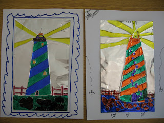
Another lighthouse project I did was with a fourth grade class using the roll of metal. 
The key to drawing successfully on this metal if you don't use it often is-
-Making sure the kids have folded newspaper underneath the metal as a cushion so that the pencil can really incise the metal
-Encouraging the students to write on both sides of the metal so that some of the lines and texture can push in and some can pop out
-I like to use the bigger pencils (like the fat ticonderoga ones) rather than regular size pencils
the fat pencils tend to make better marks without poking holes or breaking
-Demonstrate how students can fill in the SPACES with colored sharpie or metallic marker rather than just retrace their lines. This creates a successful silver outline around their drawing and details.