Showing posts with label Matisse. Show all posts

Sunday, March 18, 2012

Matisse and harmony for all.

My fifth graders are finishing up a unit on elements of color and a study of Henri Matisse. 
We began by doing a complementary color exercise and viewing the Dropping in on Matisse video which I love. 
See also my older posts and detailed steps and exercises by clicking on the Matisse label to the right.
I think teaching about Matisse's life is so encouraging for students and such a great vehicle for motivation- I always point out that he was very sick twice and both times he used a situation where most people would be less motivated to be more motivated and find a new path. 

After reviewing complementary colors and looking at a few of Matisse's artworks I did a new version of my Color Harmony Lesson that I did last year, this time using a large piece of tissue paper first and the paper tape that you moisten to turn into glue and stick down for the smaller pieces:
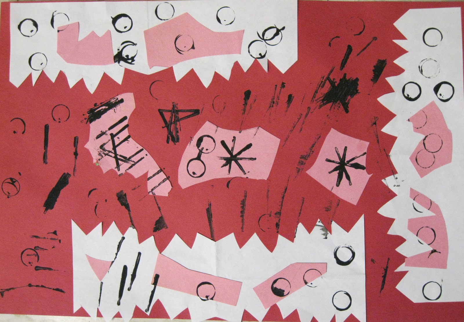
This is a one day lesson that the students examine and critique as a group when we are finished to see what types of elements create stronger harmony and composition.

We examined a handful of Matisse's paintings that incorporated windows. 


The objective of the students' work was to incorporate a window, something outside the window, a fishbowl of any form, a flower vase/pot, and fill the page with color while considering how their color choices would play out. 
They did not have to draw the entire thing out in pencil first. We "marked" where the main elements would go and I had them just go for it! They used mostly tempera cakes with some Crayola oil slicks. 


Tuesday, November 8, 2011

Spheres, Stencils, Shapes, Swoon & Beatriz Beginnings


As I have said before my school is new this year- so my fifth graders are coming from a variety of educational and art educational backgrounds. Generally I have to assume they do not have a solid foundation so I give them big props for a lot of their accomplishments with me this year knowing this is the first go around for many of my students with these materials and concepts. 
I'm trying to really layer my projects with mini-lessons that cover a lot of turf. 

This project I am very excited about. 
The first day I set up dodge balls on the tables and we reviewed 
2-D shapes vs. 3-D forms.
We also reviewed how a shadow occurs (light source, object, surface). 
This is the basic worksheet we followed. 
We filled in the Medium box first, then the light, then the dark. 
One circle was for a 2-dimensional shading using medium pressure. 
The bottom circle was for their first try at shading spheres: 


 Day 2: I showed my students this 8 minute YouTube video of Beatriz Milhazes, a Brazilian contemporary artist. It's a great video, I recommend watching it even if you don't show it to your students!
In Beatriz's interview she talks about her influences for her shapes, her process, and artists who influenced her like Mondrian and Matisse. 
After the video we reviewed Organic vs. Geometric shapes and lines. 
Each student made one organic and one geometric stencil out of a manilla folder. 

Day 3: Students traced 3 circles on a grey construction paper. 
They also traced each stencil at least two times and could use a ruler or other people's stencils to finish their composition.
Each student then chose a color set to make one circle into a 3-dimensional sphere:


Student progress so far:
More oil pastel and some painting to come!

I also have a field trip to the Institute for Contemporary Art, Boston scheduled for the students in a few weeks. They will have an introduction to contemporary art and also get to see this new mural and cut paper stencil installation by Swoon. This is another reason I wanted the students to understand the concept of a stencil. 


Monday, October 17, 2011

2-day Apple Still Life


My first graders looked at some of Cezanne's still life paintings with apples and looked closely at how the apples have different hues of red, yellow, and green. 
They painted three apples by mixing yellow and red tempera paint over turquoise or green paper. 


We reviewed warm colors and cool colors and examined Matisse's apple painting and how the warm colored apples and table stand out against the cool color background. 


To finish these the kids designed tablecloths with oil pastels. 


They were so into the concept of a still life that they wanted to do their own still life pictures as their extra time drawings when they finished their oil pastel. 
So today I set up still life arrangements (of containers and art supplies) for the FIRST GRADERS to draw from today and also went over the concepts of overlapping and viewpoints. They were so into it! 


 We just started them today but I had to share!


Thursday, April 7, 2011

Matisse Posting #3: for the younger ones

The following are examples of K & 1 students after examining paper cuttings by Matisse.

Kindergarteners testing out cutting symmetrical shapes and spaces and arranging the elements:


The first graders had a little more exposure to symmetry so we focused on constructing interesting compositions out of the cut paper, added cut scrap paper, and stamped circles and lines with scraps of mat board and empty glue sticks dipped in tempera. 


This was a follow up activity- drawing with white and black crayon first and then adding marker.
When the students finished we looked at each others papers to see what the shapes reminded us of.


Kindergarten Goldfish Bowls:


Selections from my informative (in progress in some pics) bulletin board:


Matisse Posting #2: Color Harmony


After the Black and White collage lesson I showed my students the video Dropping in on Matisse. It is a great video- about 25 minutes, and even if you don't have time to show your students its worth watching to get an idea of how to present Matisse to students and prompts for VTS.

We moved on to the concept of HARMONY- which is actually quite difficult to translate to young students in a way that they can apply to artwork and their own compositions. I begin it by asking them where they have heard the word "harmony" (they will most likely say music) and then we take it from there by drawing connections between musical harmonies and harmony in artwork.


This was a very clear-cut directional lesson where the students had to follow along rather than it being an exploration in materials.
Each student used a 9 x 9 square of white paper as the background.
Each student got three colored pieces of tissue paper, a scissors, and a glue stick.

1. The kids were instructed to choose one color to start with. They had to cut or rip one large piece and glue it down on the white.
2. The kids chose their second color- and could cut or rip 5-8 small shapes/pieces and glue them down.
3. The kids used their final color to cut one medium shape and glue it down.
** Then the students evaluated their composition and could add on other pieces they felt necessary to "balance" out their collages.

As a class we examined the artwork and identified which compositions prompted the viewer's eye to travel around the entire page- and identified the primary and secondary focal points of the compositions.