Monday, December 13, 2010

Crazy Architecture!

I have done a few variations of this project with different grade levels.  
It is always a big hit with the students.


I introduce a variety of architecture.  We talk about different styles of houses and the differences between rural/suburban buildings and urban buildings where verticality is emphasized.  This time around I introduced images of the Taj Mahal, St. Basil's Cathedral, some of Frank Geary's building designs, and others.  The students were especially fascinated by the 'hershey kiss' shapes atop the towers.

If possible we use the larger construction paper 18" x 24" if we have enough work room.
I use this opportunity to teach the students about TINTS and how when colors are blended with white they really pop out from a darker background.


Most recently I did this project with my fourth grade class who I happen to have a for a full hour NOT 30 minutes like my other classes.  The teacher whose room we hold class in also happens to be extremely hospitable with her classroom.  These pictures show how a regular classroom can become an enthusiastic art class when the right circumstances come along!


Here are some examples of how I've done the project in the past.  
(The uber-purpley ones were from a summer class of all third grade girls.)

Sunday, December 12, 2010

How many clear faces can you see in the crowd?


I am yet to have posted anything besides some of my lesson plans.  I am generally not a complainer, I make the most of the resources and opportunities given to me.  However, I had a moment this past week while trying to develop a new lesson for my fifth graders that really put the sourest taste in my mouth.  

I am working on a Seurat inspired lesson.  I thought a video of some sort would be really effective for this lesson so that the students could view Seurat's process of building up colored layers of dots and brushstrokes... a la Ferris Bueller's Day Off when they are in the museum and the camera continues to zoom in closer and closer to Sunday Afternoon on La Grande Jatte as Cameron stares into it. 

I found a Seurat-focused VHS at the public library but had to wait until I had a chance at school to use a VCR to view it, since I do not have a vcr at home. Duh. why would I have a VCR at home? I don't even think its compatible with my tv.  
Anyway.... I had to use the library tv an hour before school just so I could watch it to find an appropriate part.  The picture quality was so poor I couldn't even figure out what I was looking at.  And there I stood with a revelation, not the first time I've had this frustration but more severe this time. 

Why do most people have these fancy fancy tv's with the clearest picture quality and blue ray players so that they can watch big movies and sporting events- making sure the picture is clear enough that they can make out the faces of the fans at the game but meanwhile their kids are at school trying to watch something for educational purposes and viewing it on the oldest tv in town and waiting for a VCR tape to rewind or fast forward??.... and to boot - I'm trying to show details of Seurat's paintings- the tiniest most complicated combination of brushstrokes and we can barely see through the fuzz of the tv!!!! 

I just don't understand this.  
I realize some of you educators out there have access to good technology.  And I am really glad that it does exist in some education settings, but it should exist in all of them!
I used to bring my laptop from home in to school just so I could try to do a quick slideshow with my students, but my laptop had been dropped one too many times and the battery is shot, that ended that.  I should be able to hook up a projector whenever I want and not have to factor in an hour of set up time before my class.  I should be able to model for my kids how you can view YouTube videos of painters and modern artists creating large scale installations or how traditional Molas are made or how Kente cloth is worn or woven, but that is not possible in my school.  And it saddens me.... 
My students are mostly of low income socioeconomic backgrounds.  They do not have access to technology at home (most of my students main use of technology is for video games), they need to learn technology skills so that they can perform strongly as they move on to high school and college and be strong candidates as they apply for jobs in the future.  

So for those of you with access to good technology- USE IT! 
Art educators can incorporate technology into their classroom routines in as meaningful a way as we incorporate exploration of materials! Encourage students to make art and the viewing and exploring of art a part of their daily life!

Thursday, December 9, 2010

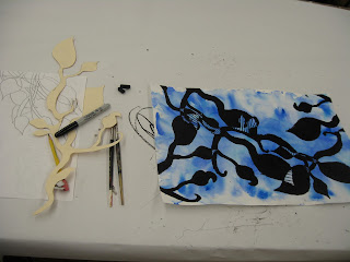
Abstracted Plants with Watercolor

This project began with the students choosing one color for a base wash on their paper. 


Then we switched into observational drawing gear. 
The students did a number of contour, blind contour, and line drawings zooming in and out. 
I had them choose one part of a contour drawing to create a stencil out of.  They used this stencil to trace the plant shape on to their wash paper a number of times.  The stipulation was that it had to touch a side so that it gave the illusion of growing from somewhere. 

The students colored in the plant contours with black sharpie, black crayon, black craypa, and white craypa.  Then they added on patterns and deeper hues using analogous colors that related to their initial wash color choice.  


Underwater Watercolor

I have been meaning to post some of the lessons I've done with older grades.  I have some more to come very soon too- I promise!
This project is courtesy of Janet A., a high school art teacher.  I taught a middle school watercolor class this summer and needed some project ideas because it had been a while since I've taught watercolor!


Janet suggested showing the students how to use flat brushes dipped in multiple colors and twistin back and forth to create seaweed.  After we painted blue washes we used brushes dipped half in a light green and half in a dark green to create dragged, twisting seaweed.

The next part of the project challenged the students to do more careful, detailed painting when it was time to add the fish.


Thursday, December 2, 2010

Mountain Landscape Collages

Because I travel around the school to the classrooms for art class I try to use similar materials or resources such as images and handouts for various classes and differentiate the lessons for other grades. 
This 2nd grade project developed out of the 5th grade Majestic Mountains lesson. 

The first two parts of the project were broken up into the "mountain skyline" and a resist painting that will be used later for the sky background. 

I used gray paper for the mountains- the students drew a mountain skyline - after discussing what true mountains look like and how zig zag lines or triangles are "symbols" for mountains rather than being actual mountain.  
They cut out the mountain line and then dotted the top with white tempera painted for snow. 

For the sky painting I had them draw with white crayon on white paper. 
Crumple the paper (which they love to do). 
And paint a wash with tempera cakes (I used turquoise and royal blue)
The magical nature of white crayon appearing through water-based paint never gets old!!


I stapled the gray mountains to the blue backgrounds.  
Then the students created hot air balloons for the sky and also drew landscapes closer in view at the bottom.  We discussed how to make parts of the picture look closer and farther away.  The kids glue tissue paper to make textural water, grass, trees, etc at the bottom. 


Wednesday, December 1, 2010

Snowmen Paper Collages


Mystery Solved!... Laura from Painted Paper informed me it was her image :)
I saved this image from 
last winter and was inspired for this  fantastic snowman collage project!
I loved how this lesson focused on encouraging the students to consider point of view.  We discussed the difference between head-on and profile and what happens when you're looking at some one turned only part-way.  
I also liked how the compositions cropped in on the snowman rather than stick the snowman in the middle, pushing the kids to think differently about composition and editing.

The artists first filled in the snow part with ripped white paper.  Then cut out hats with black construction paper, added buttons, and we used the leftover orange paper from the Winter Wonderland lesson for the noses.  
Most of the students practiced making AB patterns with on their scarves.  
And last but not least we used mat board scraps for stamping white tempera paint to make some snowflakes in the background. 


I am adding on the version of this I did this year... I have less class time this year so the students painted the snowballs first with white tempera.  Instead of paper collage for the details we used oil pastels but still concentrated on the 3/4 view of the snowman's face vs. profile or head on.


Tuesday, November 30, 2010

Funny Pinch Pot Characters

This project is courtesy of my art teacher friend Sarah.  
It's a simple but great step up from the typical pinch pot.  

Texture/Slab/Clay.... Candy Dish!

We rolled out clay slabs and sliced them into about 8 x 8" inch squares, 1/4-1/2" thick or so. 
Using various tools the students experimented with making different textures and patterns.  Some of the tools included forks, popsicle sticks, empty glue sticks, toothbrushes....

 Then each student cut four slices diagonally from the corners. 
 We discussed slip or scoring- or "scratching and attaching"- or as I like to call it "clay velcro".  I call it this because I explain how two edges need to have rough texture in order to adhere to each other strongly.  They always get it after that.  
We attached the corner slices together and turned the 2-D forms into 3-D forms.  
These were fired and glazed.  They make great candy dishes!