Showing posts with label autumn. Show all posts

Wednesday, November 7, 2012

Autumn tree collages


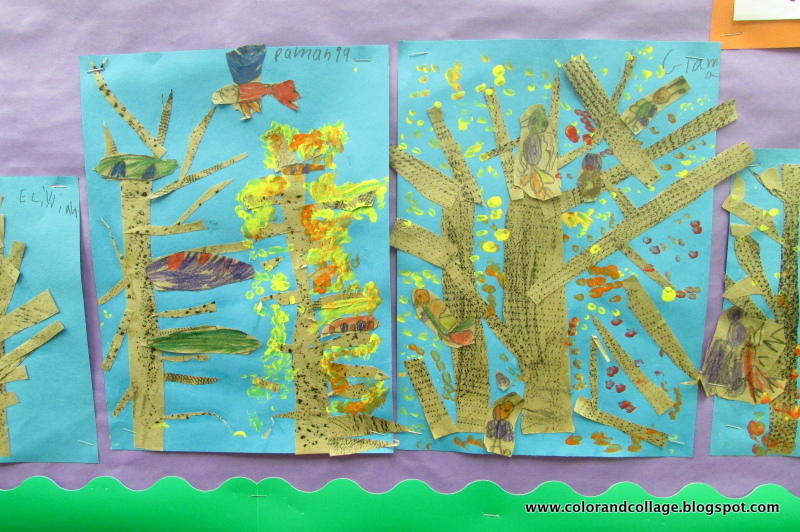
First graders did texture rubbing with black chunk crayons on cut up craft paper. 
Then we made trees (a la the strategy I have used for other projects see here and here).
I like using this strategy with kinder and first grade because it really makes a difference when they go to draw trees and they feel comfortable adding on branches rather than resorting to "lollipop trees".

Going on, 
The next class we took a look at Amate Barkcloth Painting. 
The kids drew birds, nest, and brightly colored eggs using colored pencil on scraps of craft paper, cut them out and glued them on to the trees. 
*They are a little hard to spot on the pictures, I"ll take a few details more tomorrow. 


*The color came out kind of funky on a few of these photos for some reason, I apologize.


 Lastly, using long cotton swabs (one of my favorite items ever!, especially for plates of elmers glue)
we dotted on yellow, orange, and red tempera for the leaves. 


They have been added to my autumn leaf color wheel bulletin board. 

 This idea was actually my principal's! I took it and ran with it and it is really cool!
Kids can bring in leaves and pin them up.


Thursday, October 25, 2012

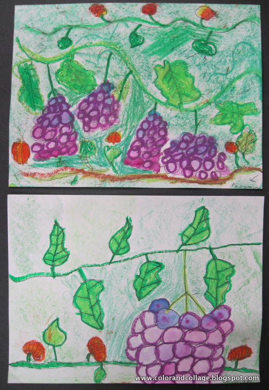
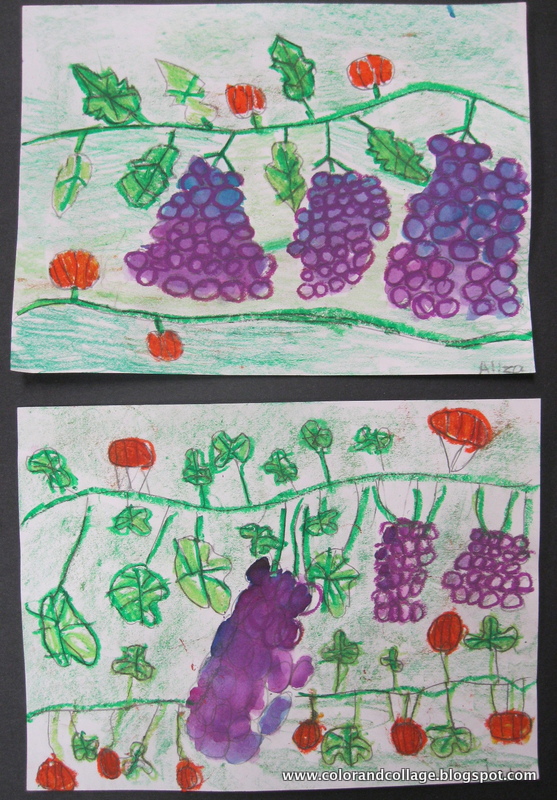
Grapevine color studies

Second grade analogous color study with grapevines and now pumpkin vines too!
Oil pastel, crayon rubbing, and watercolor. 
Some final products for you following my post the other day.


Wednesday, October 24, 2012

Autumn leaves, stencils, and color study

I challenged my second graders to draw oak and maple leaves rather than simpler types of leaves- because I knew they could. :)
They complained and there were some tears- and some discussions about how things from nature have 'weird' shapes that will never right- but in the end they did an awesome job!
We turned their leaves into stencils to use for their final product. 
Then we moved on to foreground and background
THEN we moved on to analogous colors. 

(if you want more info on one of my analogous color teaching strategies click here,
if you want to see more of my past leaf and autumn color lessons click on the labels to the right)


 The two analogous color groupings we used were yellow/yellow-green/green and yellow/yellow-orange/orange. 
The leaves we sprinkled salt on for a little added effect. 


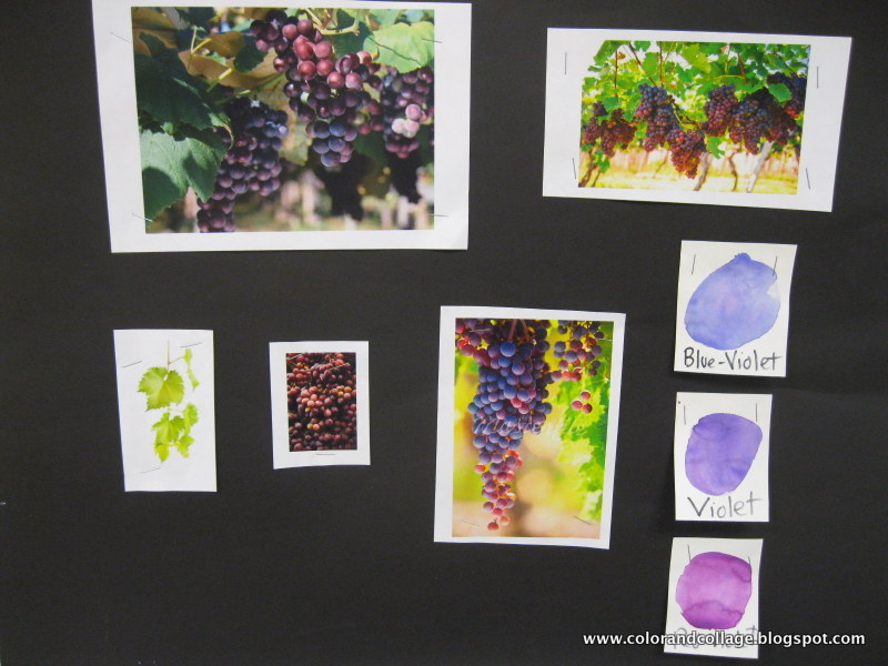
For the follow up to this lesson to drive in the analagous color study we are drawing grapevines
and painting with red-violet, violet, blue-violet. 
They aren't done yet but here it is in-progress:


Sunday, October 30, 2011

Kinder Pattern Pumpkin Collages


This lesson was broken down into a lot of parts....

Part one: A-B Patterns
I folded 9 x 12 yellow paper into four columns.
Students drew vertical AB patterns in each column, traced them with sharpie,
and colored them with oil pastel.
Then we painted the papers with yellow, orange, & red tempera cakes.

Part two: The Vine
Students drew a vine with a leaf on manilla paper.
They painted it in with green tempera paint.


Part three: Background
I have these great leaf texture rubbing tiles-
The goal was for students to do leaf rubbings and have it look like a leaves on the ground or in a pile. Then some of them colored them with marker.

Part four: Cutting (oh my..... big mess, but worth it.)
Students traced and cut a pumpkin out of their pattern painting.
They also cut out their vine and leaf.
We glued these on to the background.


Oil Pastel Pumpkin Vines


The first part of this lesson focused on Contour lines, Positive & Negative space, 
and Organic vs. Geometric lines and shapes.  

 I introduced this piece by Lisa Congdon because I liked the use of a collaged background with the negative shapes

and also a selection of Cary Smith's prints that show great examples of simple yet interesting positive and negative compositions. 

This lesson was focused on organic lines and shapes and we used a pumpkin vine as the main subject. 
Each student drew an organic diagonal line as the vine- and then only the contour of pumpkin leaves and pumpkins. They painted them in with white tempera.

 One of my old high school students was a very active graffiti artist but also a remarkable painter and collage artist. He would always insist on painting white under anything he would paint in order to make the colors and image brighter. He was my inspiration for this base step. (Thanks Rascal) :)

 Day Two... color blending with oil pastels. We went over tertiary colors and I gave the kids yellow, orange, lime green, and grass green oil pastels. They also got a q-tip for blending and a pointy stick for scratching details.
I specifically showed them how to make the pumpkin look more round by highlighting the side with yellow first and then blending orange. I also demonstrated blending the various greens for the vine and leaves. Most of my students have never done much color blending before so they were enamored by this and also very successful. They could also scratch back into the oil pastel with the stick. 


 Unfortunately they did not translate as well to camera :( 
I love how they match up though and look so striking when they are all arranged together. 


Extra Large Acorns

This was a quick, easy, and successful lesson focused on printing, texture, & earth tones. 

Day one - draw the shape of the acorn on a 9x12 paper taking up the entire space. 
 Students painted around the outline with black tempera and then printed with cardboard strips dipped in black tempera to create the acorn top texture. 

 Day Two- introduction to Earth Tones. Students mixed different shades of brown by mixing brown, white, and orange. They painted in the top part first, using the printed lines as a guide. 

 Then most students made an attempt at color blending and mixing more shades of brown to fill in the bottom. 

 We are going to cut them out this week and hang them on the giant tree in the hallway. 

Monday, October 17, 2011

2-day Apple Still Life


My first graders looked at some of Cezanne's still life paintings with apples and looked closely at how the apples have different hues of red, yellow, and green. 
They painted three apples by mixing yellow and red tempera paint over turquoise or green paper. 


We reviewed warm colors and cool colors and examined Matisse's apple painting and how the warm colored apples and table stand out against the cool color background. 


To finish these the kids designed tablecloths with oil pastels. 


They were so into the concept of a still life that they wanted to do their own still life pictures as their extra time drawings when they finished their oil pastel. 
So today I set up still life arrangements (of containers and art supplies) for the FIRST GRADERS to draw from today and also went over the concepts of overlapping and viewpoints. They were so into it! 


 We just started them today but I had to share!